A lot of the feedback that I have received on Solomon Says (a big thank you to everyone who spent time and effort providing it) has been regarding the styling and design aspect of the website. Or rather, the lack of it styling and design aspects in the website. Now, I am no designer. CSS3 and templating were not quite my fortes when I started working on it. So operating out of my ignorance of these fields, I have been forced to improve the design of the site in increments. Get something working, make it usable, and put it out there. Then improve what it looks like in the next iteration.
I'd like to share with you some of the changes I'm currently working on to the layout of the review pages. This primarily involves improving the data panel just above the text of the review. For the uninitiated, this is what it currently looks like on book and travel reviews respectively.


Both look very cramped and difficult to interact with. The huge orange rating section is sort of a waste of space, and the images don’t get due prominence (especially harmful on travel reviews). So I thought through these problems and came up with a small redesign which hopefully makes everything cleaner and easier to access. Check it out.


The new version is only slightly different from the current one but I think it lends a much more spaced-out feel to the whole page. You would also have noted that there is a small panel of image thumbnails right above the ratings section. These are the images that currently show up below the text of the review, like so:

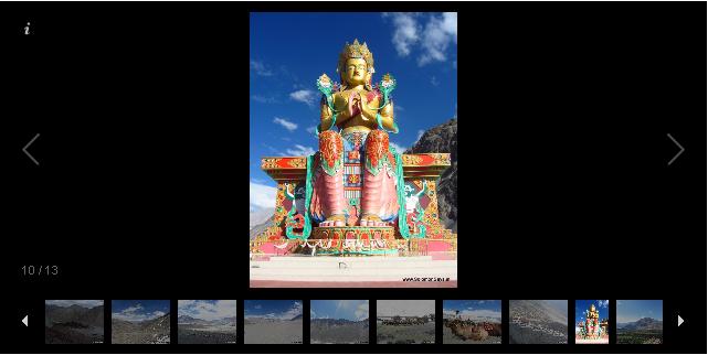
I never really this design because pics are cool and everybody loves them. So I moved the images right to the top in a combination of sliding thumbnail carousel and Fancybox. Now they are easily accessible, and clicking on the thumbnail gallery blows them up to full size too! Like this.

A lot more groovy, even if I say so myself! I am planning to roll out the changes in about two weeks after a few minor tweaks and testing.
So what do you think? Like the new look? Not quite? Let me know in the comments or drop me a line at solomonsaysindia@gmail.com. Suggestions/flowery words of praise/hate mail are all welcome.
I'd like to share with you some of the changes I'm currently working on to the layout of the review pages. This primarily involves improving the data panel just above the text of the review. For the uninitiated, this is what it currently looks like on book and travel reviews respectively.


Both look very cramped and difficult to interact with. The huge orange rating section is sort of a waste of space, and the images don’t get due prominence (especially harmful on travel reviews). So I thought through these problems and came up with a small redesign which hopefully makes everything cleaner and easier to access. Check it out.


The new version is only slightly different from the current one but I think it lends a much more spaced-out feel to the whole page. You would also have noted that there is a small panel of image thumbnails right above the ratings section. These are the images that currently show up below the text of the review, like so:
I never really this design because pics are cool and everybody loves them. So I moved the images right to the top in a combination of sliding thumbnail carousel and Fancybox. Now they are easily accessible, and clicking on the thumbnail gallery blows them up to full size too! Like this.

A lot more groovy, even if I say so myself! I am planning to roll out the changes in about two weeks after a few minor tweaks and testing.
So what do you think? Like the new look? Not quite? Let me know in the comments or drop me a line at solomonsaysindia@gmail.com. Suggestions/flowery words of praise/hate mail are all welcome.
No comments:
Post a Comment